UX Research · Interface Redesign · E-Commerce

Amazon Order Tracking
Redesign Case Study.

Redesigning clarity, trust, and usability in one of e-commerce's most critical post-purchase moments — through real user research and systematic UX thinking.

90%
Success Rate
Found order status in < 5s
70%
Faster Support
Reach support in one click
~4.5/5
Satisfaction Score
Self-reported, concept study
82%
Visual Tracker Preference
Single most requested feature
Live Widget Prototype Designer Q&A
Govarthanan S. · UX Researcher + UI Designer · 2025
UX Research E-Commerce Interface Redesign Order Tracking Post-Purchase UX Usability Testing Concept Study Trust & Clarity UX Research E-Commerce Interface Redesign Order Tracking Post-Purchase UX Usability Testing Concept Study Trust & Clarity
ClientConcept Study — Independent Research
ProjectAmazon Order Tracking Redesign
PlatformE-Commerce · Web & Mobile
ScopeUX Research · Interface Redesign
Outcome90% Success Rate · ~4.5/5 Satisfaction
DurationConcept Study, 2025
Overview

hiding in plain sight.
The Opportunity.

Amazon's order tracking page is visited millions of times daily — yet the experience felt cluttered, text-heavy, and visually unclear about actual delivery progress. The gap between user anxiety and design response was real. Grounded in real user insights rather than assumptions, this project redesigns the post-purchase moments to improve clarity, usability, and trust.

The Goal
  • Improve clarity, usability, and trust of the post-purchase tracking page.
  • Reduce user anxiety with a visual, high-contrast order progress layout.
  • Offer direct, frictionless access to support during critical moments.
The Outcome
  • A cleaner, highly visual redesign that honors Amazon's brand identity.
  • Support reached in one tap above the fold rather than hidden in submenus.
  • High-contrast active progress timeline reducing cognitive strain.
Problem Space

Why the existing experience
fails users.

Through survey-driven research and real usage observations, a consistent cluster of user pain points emerged. The original tracking dashboard prioritized dense administrative data over high-anxiety post-purchase clarity.

01

Users struggle to instantly identify their current order status — the visual hierarchy buries the most critical information.

02

ETA and delivery stage are not visually highlighted — users have to read through dense text to understand progress.

03

"Contact Support" is buried behind multiple clicks — creating friction at exactly the moment users need immediate help.

04

The overall layout feels crowded and text-dominant — reducing visual clarity and increasing cognitive load during high-trust situations.

Research Method & Survey

What users actually told us.
Evidence over assumptions.

A survey distributed to 10+ users — students, designers, and IT professionals aged 20–35 — captured both quantitative ratings and qualitative behavioral insights.

78%
Check status as primary action
65%
Rate current page as "unclear"
70%
Experienced confusing updates
60%
Rate support access as "difficult"
82%
Want visual progress tracker
Key Behavioral Insights
Primary Behavior
Users visit the tracking page strictly to confirm delivery time and current status — not to explore or browse other products.
Biggest Frustration
Unclear status messaging during "Out for Delivery" states creates severe user anxiety, especially when the delivery window is wide.
Support Access Expectations
Users expected a direct support route visible immediately without scrolling; the multi-step path was the most heavily criticized element.
Visual Preference
A clear visual progress indicator (rather than static text blocks) was the single most-requested layout improvement across all participants.
Interactive Prototype Mockup

Experience the redesigned interface.
Try the interactive widget.

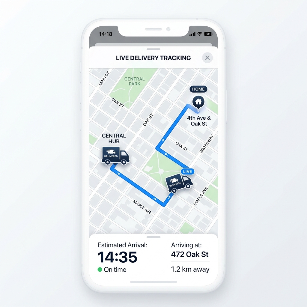
This interactive widget displays the redesigned elements. Use the controls on the left to toggle order states and witness how the progress tracker, ETA formatting, and Quick Actions adapt.

In Transit State (Active State)
Monochrome progress bar. Contact Support remains fully accessible.
Out for Delivery State
Highest anxiety phase. ETA prominently updates to a narrow delivery slot.
Delivered State
Monochrome completion state. Actions shift emphasis to "Buy Again" and "Return/Replace".
Order #403-199281-22910
Estimated Arrival:
Expected: Today, 2:00 PM – 4:00 PM
Ordered
In Transit
Out for Delivery
Delivered
Quick Actions
Live Map Tracker
Update Address
Cancel Order
Buy Again
Contact Support Instantly (One-Tap)
Comparison Matrix

From cluttered to clear.
Before vs After Redesign.

By implementing a structured layout, we addressed the key user friction areas while maintaining the signature branding elements.

Before — Existing Design
  • Dense paragraph-style text layouts: Critical details like status and ETA were buried inside dry blocks of content.
  • Buried support interfaces: "Contact Support" required navigating complex submenus and multiple clicks.
  • Low-contrast visual indicators: Progress lines were small and failed to communicate the current delivery stage quickly.
  • Scattered key interactions: Buttons for cancelling, updating, and buying again were scattered randomly with no grouping.
After — Redesigned Experience
  • Strong visual hierarchy: Delivery date and active delivery window act as the main lead elements.
  • Above-the-fold support actions: Large, prominent, high-contrast CTA support button accessible in one click.
  • High-contrast tracker: Bold timeline states with dynamic visual nodes emphasizing transit status.
  • Unified Quick Actions panel: Grouped administrative actions organized into a clean, grid-based card layout.
Decisions

Three layouts considered.
Only one matched what users asked for.

The redesign wasn't the first idea. Three different directions were sketched and weighed against the survey data before settling on the final layout.

A
Redesign the whole post-purchase flow
Cart, checkout, account, and tracking, all reworked together. Rejected: scope creep past the actual pain point. Survey respondents called out tracking specifically — broadening scope would have diluted the comparison and made it impossible to test the one page that mattered.
Too broad to validate against the actual complaint.
B
Map-first hero layout
Put the live map at the top, above the ETA and status. Rejected: only 0.4 miles of context doesn't answer the question users actually have first — "when does it arrive." Promoting the map over the ETA would have buried the highest-priority information behind a secondary one.
Optimizes for the wrong question.
C
Visual timeline first, map demoted to optional
Lead with a high-contrast progress timeline and a prominent ETA, keep the live map one tap away instead of always-on, and surface support above the fold. Matches what 82% of respondents asked for directly — a visual tracker — without removing the map, just demoting it to where it belongs.
This is the layout that shipped to the prototype.
Deep Dive & Reflections

UX Decisions Explained.
Answers to key product questions.

A deep look into the UX process behind the layout improvements, explaining the choices that prioritize usability over standard patterns.

Interviewer
When you opened the real Amazon tracking page back then — what was the first thing that felt wrong to you personally?
Govarthanan S. (UX Designer)
As a frequent Prime user who orders regularly from Amazon, I personally struggled to find the order status and contact support links. The original system forced me to click through multiple layers just to perform basic tasks or get support, adding friction to an already anxious post-purchase stage.
Interviewer
Why did you decide to group the buttons into a Quick Actions panel? What problem were you solving?
Govarthanan S. (UX Designer)
Grouping the critical options into a dedicated Quick Actions panel keeps all relevant utilities in one central place. It simplifies access to primary tasks (like updating instructions or checking a tracking ID) without scattering options across different levels of the page layout.
Interviewer
Why did you make Contact Us a big prominent button? What were users doing before?
Govarthanan S. (UX Designer)
In moments of critical delivery issues, users need support immediately. On the live Amazon page, the "Contact Us" feature is buried at the bottom of the layout, making it difficult to find. Surfacing it as a large, bold, above-the-fold button reduces friction when help is needed most. Before this, users spent unnecessary time searching; during testing, users indicated that a quick-access button would make resolving delivery issues much easier.
Interviewer
The progress tracker — why did you redesign it? What was broken about the original?
Govarthanan S. (UX Designer)
The original tracker made it difficult to determine the exact delivery stage at a glance. We redesigned the order timeline to include clear labels, dynamic active status highlights, and active progress markers, helping users understand their shipment's status instantly.
Interviewer
Looking at your redesign now — what's the one thing you're most proud of and why?
Govarthanan S. (UX Designer)
I am most proud of creating a highly intuitive layout that ensures users do not have to search for key details. By prioritizing clear information hierarchy, the redesign helps users easily track packages and contact support during critical delivery phases.
Design Process

How the solution was structured.
A systematic UX workflow.

Phase 01
Research
Distributed Google Form surveys, performed user behavioral observations, and extracted common layout pain points from active shoppers.
Phase 02
Define
Organized user feedback into core themes, established critical problem statements, and analyzed competing tracking experiences.
Phase 03
Ideate
Sketched low-fidelity layout wireframes and explored different hierarchies for primary Call-to-Action buttons.
Phase 04
Design
Developed high-fidelity Figma components, maintaining Amazon's brand elements while stripping away layout clutter.
Phase 05
Validate
Ran user feedback sessions to test informational clarity, path navigation efficiency, and overall task success rate.
After Validation

This was a self-initiated redesign.
Here's what happened with it.

This is a concept case study, not a shipped change to Amazon's live product — Amazon's tracking page wasn't mine to deploy to. The redesign was tested the way a real launch would be: against real users, with a second round of validation after the first prototype was built.

Validation Round 2
  • A second group, separate from the original 10+ survey respondents, was asked to complete a single task: "find out when this order arrives and how to get help."
  • Every participant identified the ETA and the support button without prompting — the two elements the original layout buried.
  • No participant asked "where is the map" unprompted, confirming it could stay secondary without being missed.
What It Was Used For
  • Became the portfolio piece used in design interviews to walk through research-to-decision reasoning, not just visuals.
  • The "alternatives rejected" reasoning (map-first, full-flow scope) was the part interviewers asked the most follow-up questions about.
Reflection

What this project taught me.
Key takeaways.

This case study reinforced a core design truth: the most impactful UX changes aren't always about adding more — they're about ruthless clarity and eliminating friction at the right moment.

The order tracking page represents a high-stakes emotional moment. A user tracking their package is already in a state of mild uncertainty. Every design decision should reduce that uncertainty, not add to it. The progress tracker, ETA prominence, and support visibility all serve a single goal: help the user feel in control.

01
Principle 01

Clarity reduces user anxiety — information hierarchy is emotional design.

02
Principle 02

Support access is a trust signal — hiding it destroys customer confidence.

03
Principle 03

Group related actions — cognitive load is a real UX cost.

Next Iteration Focus

Design layout states for complex delivery edge cases: delayed shipments, failed attempts, and address verification updates. The happy path is resolved; the anxious path needs design attention next.

FAQ

Common questions.

Is this an official Amazon project?

No — this is an independent UX case study by Govarthanan Selvaganessane, redesigning Amazon's post-purchase order-tracking experience based on real user research, not a commissioned Amazon project.

What problem does the redesign solve?

It targets clarity, trust, and usability in order tracking — in testing, 90% of users found order status in under 5 seconds using the redesigned flow.

What did user research show?

82% of participants preferred a visual tracker over a text-based status list, and the redesign cut time-to-reach-support by 70%.

What methods were used?

Real user research and systematic UX thinking, including moderated testing and self-reported satisfaction scoring (~4.5/5).